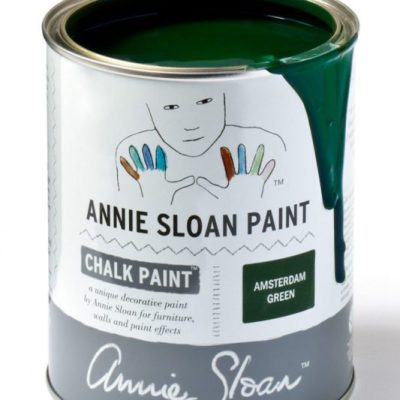
Annie Sloan: This strong, deep green takes inspiration from the painted shutters and doors of Amsterdam. It works particularly well with whites and creams and botanical imagery and plants, as well as looking brilliant with earthy yellows and reds – try teaming it with Primer Red, Arles and Old Ochre. It’s also makes a great backdrop to cool blues, such as Provence, Giverny and the purple tones of Emile.
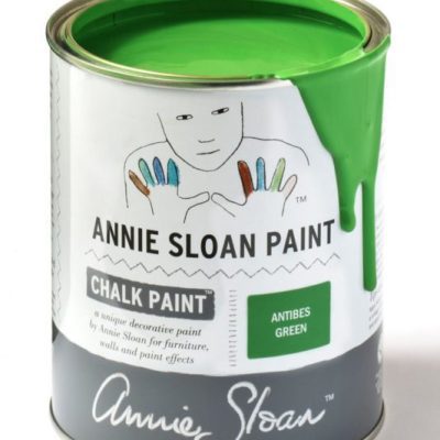
Annie Sloan: The neoclassical palette included this bright green, sometimes pure and sometimes lightened with white. The colour is also found on rustic country furniture from Ireland and the south of France – a look which is beautifully achieved with Dark Chalk Paint® Wax. For a warehouse look, try Black Chalk Paint® Wax.
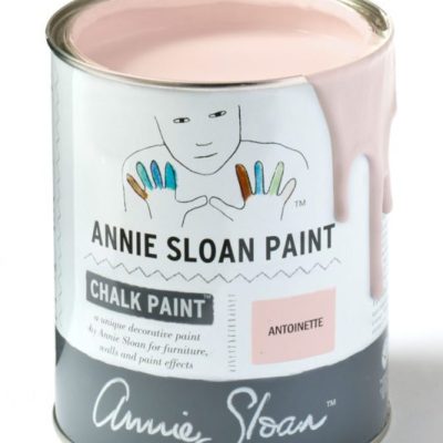
Annie Sloan: Antoinette is a soft pale pink inspired by the decorative pieces and interiors of 18th Century France, when the finest red earths were mixed with white and used to make a clear, but dusky colour for walls.
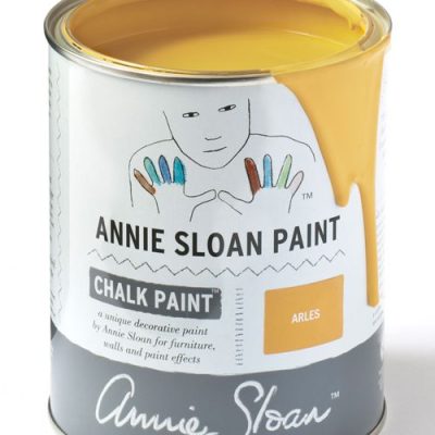
Annie Sloan Cream Arles Paint: This rich, deep yellow was inspired by the town of Arles in the south of France where a wide range of earthy yellow ochres are dug straight from the ground. It’s a natural rustic color as well as a modern color.
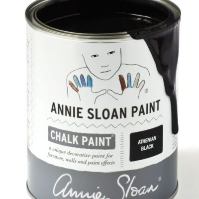
Annie Sloan: Athenian Black is a true, deep black developed to reflect the opaque figures and dramatic silhouetted shapes painted on Ancient Greek ceramics.
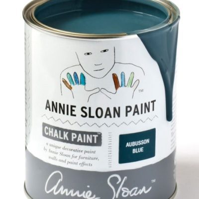
Annie Sloan: Named after the blue found in classic Aubusson rugs from France, this colour is inspired directly by the development of Prussian Blue in the late 18th Century. It’s the perfect colour for a Swedish interior.
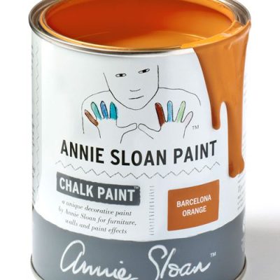
Annie Sloan Barcelona Orange Chalk Paint: This vivacious, modern orange is based on the color used copiously by the Impressionists, in early advertisements and in 1960’s decoration. Such a brilliant orange was not available until the early 20th century. With Black Chalk Paint® Wax, it becomes burnt orange the color of some Chinese lacquer.
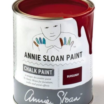
Annie Sloan: A rich deep warm red the colour of dark cherries, Burgundy finds its early inspiration in Pompeii. It also has a strong a strong neoclassical heritage, making it perfect for sophisticated painted furniture.
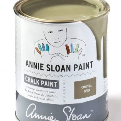
Annie Sloan: This elegant greyed green is inspired by the colour created when decorative painters mixed all their leftover colours together to make a base paint. It is the traditional colour found in French woodwork.
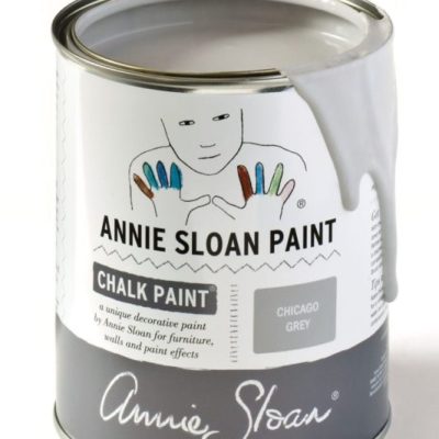
Chicago Grey is a cool, fresh and modern grey, with a hint of blue. Suggestive of the architecture in Chicago. A perfect neutral for industrial interiors, or muted Scandinavian styling.
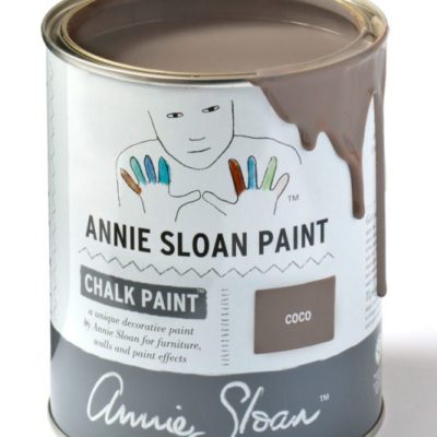
Annie Sloan: Inspired by the warm pigment, Burnt Umber, this is a classic colour that has long been used in decorative work. Use Coco on its own or as a neutral.
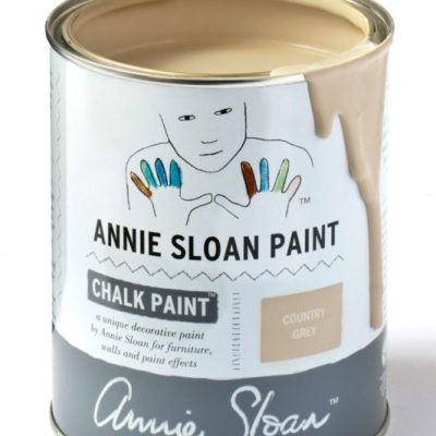
Annie Sloan: Country Grey is a perfect cool soft neutral. Made with raw umber pigment, it is the classic choice for so much painted furniture. It is also a great foil for other colours.
Annie Sloan Cream Chalk Paint: Cream is based on the traditional yellowish color that was used on old woodwork. You can use it as part of a retro fifties look or pair it with Paris Grey for a vintage French look.
Annie Sloan: Svenska Blue is a crisp and cool toned blue-grey, evocative of the colours seen throughout Swedish manor houses in the 17th and 18th Century.
Annie Sloan: A warm soft aubergine colour with pink red undertones giving a rich complexity that makes beautifully sophisticated lilac tones when Old White is added. A colour first used by artists and then later in decorative work, Emile finds its beginnings in bohemian Paris.
Annie Sloan: Emperor’s Silk is a bright pure red like the silk lining of a jacket. It is also the red of Chinese lacquer, especially when deepened with Black Chalk Paint® Wax. Use it in the interior of a cupboard or drawer for a pop of colour.
Annie Sloan English Yellow Paint: An English color from the development of Chrome Yellow pigment in the 18th Century and inspired by hand painted Chinese wallpaper. This was the first non-earthy yellow. It’s also a great fifties vintage color.
Annie Sloan: Firle is one of three exclusive colours Annie has created as a part of the Annie Sloan with Charleston collaboration. Firle is a fresh, zesty and crisp green which echoes the gorgeous distemper of the wall surrounding the mantelpiece in Clive Bell’s study.
Annie Sloan: Florence is a sophisticated grand colour found in neoclassical Italian and French interiors and on painted furniture. The colour originates from copper green minerals and malachite. It’s also a great modern 20th Century colour.
Annie Sloan: A cool neutral inspired by the colour of aged natural linen. This khaki grey works beautifully with golds and a range of rich and bright colours such as Emile and Emperor’s Silk.
Annie Sloan: Giverny is a bright, clean and cool blue in the Annie Sloan palette. It is near the greener range of blues, without any red in it.
Named after the village in Northern France where Claude Monet lived, this brilliant blue was especially popular in early 20th Century interiors and is perfect for a mid-century to modern contemporary palette.
Annie Sloan: Graphite is a soft black inspired by Lamp Black, a traditional pigment. It works for many interiors from neoclassical to modern. When waxed, it becomes a beautiful black like dark slate.
Annie Sloan: Louis Blue is a greenish soft blue reminiscent of Rococo French and Swedish interiors. Pair this clean pastel blue with white for a fine Rococo look or combine with brights for a vintage retro aesthetic.
Annie Sloan: The Grand Tours of the 18th Century brought this colour into the finest houses of Europe as part of gentle neoclassical schemes and was combined with other strong pastels.
Annie Sloan: Named after the harbour town in Normandy, Honfleur is a colour inspired by the rich warm browns found in the rustic French countryside as well as in Mid-century Modern design.
This rich brown works well with bright colours such as Scandinavian Pink and Antibes Green. It can also look elegant and classical when paired with pastels like Duck Egg Blue or Antoinette.
Annie Sloan: A soft, warm green, inspired by fields of alliums that Annie saw in Ethiopia, grown by women farmers who are supported by Oxfam’s Ethiopian Seed Project. This pastel is great for creating a retro 50’s look, and works well as part of a vintage floral style.
Annie Sloan: Louis Blue is a greenish soft blue reminiscent of Rococo French and Swedish interiors. Pair this clean pastel blue with white for a fine Rococo look or combine with brights for a vintage retro aesthetic.
Annie Sloan: Napoleonic Blue is inspired by the ultramarine and cobalt blue pigments used for decorative work in everything from neoclassical interiors through to modern 20th century decoration.
Annie Old Ochre Paint: Old Ochre is the faded darkened cream colour seen on old French painted furniture, woodwork and door exteriors. Apply Dark Chalk Paint® Wax to make the color more intense and evocative of Paris, or keep it clean as a neutral foil to other colors.
Annie Old Old Violet Paint: Like deep Parma violets or blue lavender, Old Violet is a wonderful 18th Century color inspired by the colors of ancient Rome. Beautiful on its own or paired with red for a little Parisian boho.
A warm, slightly creamy, traditional white, Original is the colour of old painted furniture. It is perfectly paired with Duck Egg Blue, Antoinette and Louis Blue for a delicate old distressed French look.
Annie Sloan: Oxford Navy is an inky, traditional navy blue which evokes the strong, august blue of academic insignia and fountain pens, as well as the rich pigment indigo blue so synonymous with traditional Indian block printing.
Paloma is made from mixing purple and yellow complementaries with white to make a soft warm neutral taupe grey. It is both a modern contemporary colour and a classic colour that was used when a range of purples first became possible.
Annie Sloan: Soft, gentle Paris Grey is inspired by the painted furniture found in elegant French châteaux or old Swedish manor houses. It’s made from a mix of blue and orange, so it works naturally well with these complementaries. Use it over Primer Red or Cream, or with Old White or Original.
Annie Sloan: Primer Red is a colour found in practically every culture, appearing in everything from Venetian palaces to Vietnamese temples, where red earths were plentiful and relatively easy to come by. Use it for rustic pieces or as a base for sophisticated colours like Château Grey or Versailles. It also works beautifully under gilding.
Annie Sloan: The south of France has shutters and doors painted in a range of turquoise blue greens, some bright and some faded. Provence was inspired by these colours. It also works beautifully for a modern look.
Annie Sloan: Rodmell is one of three exclusive colours Annie has created as a part of the Annie Sloan with Charleston collaboration. Rodmell is a dusty, damson purple, influenced by the painterly washes of twilight shades on the Studio walls, the creative hub of the farmhouse for over 50 years.